- August 24, 2023
- Posted by: Admin
- Category: Uncategorized
In the rapidly evolving digital landscape, where online interactions have become the cornerstone of business success, medium-sized enterprises are at a pivotal juncture. The digital realm offers unprecedented opportunities for growth, outreach, and engagement, but the key to unlocking these possibilities lies in crafting an exceptional online presence. In this article, we delve into the transformative potential of responsive web design. This dynamic and adaptable approach empowers medium businesses to transcend boundaries, captivate audiences, and forge lasting connections in the virtual realm. We explore how responsive web design can help medium-sized enterprises maximize their Online Presence
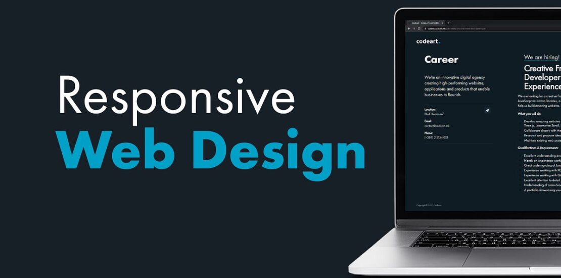
What is Responsive Web Design?
Responsive web design (RWD) is a web design approach that makes websites render well on a variety of devices, from desktops to laptops to smartphones. This is important because more and more people are using their mobile devices to access the internet. In fact, according to a recent study by Statista, over 55% of website traffic now comes from mobile devices.
An RWD website will automatically adjust its layout and content to fit the size of the screen it is being viewed on. This ensures that users have a good experience no matter what device they are using.
Key principles of responsive web design
- Fluid grids
A fluid grid is a layout that is based on percentages instead of fixed pixels. This allows the layout to automatically adjust to the size of the screen it is being viewed on.
- Flexible images
Flexible images are images that are scaled to fit the size of the container they are placed in. This prevents images from being cropped or distorted on smaller screens.
- Media queries
Media queries are CSS statements that allow you to specify different styles for different screen sizes. This is how you can control the layout and content of your website for different devices.
- Mobile-first
Mobile-first design is an approach to web design that starts with the mobile version of the website and then builds the desktop version from there. This is important because more and more people are using their smartphones and tablets to access the internet.
- Progressive enhancement
Progressive enhancement is a web design approach that starts with the most basic version of the website and then adds features and functionality as the user’s device and connection speed allow. This is important because it ensures that everyone can access your website, regardless of their device or connection speed.
- Accessibility
Responsive web design should be accessible to everyone, including people with disabilities. This means using clear and concise language, avoiding unnecessary animations and effects, and providing alternative text for images.
How responsive web design can help medium-sized enterprises maximize their Online Presence
- Reach a wider audience
More and more people are using their mobile devices to access the internet. In fact, according to a recent study by Statista, over 55% of website traffic now comes from mobile devices. This means that if your website is not responsive, you are missing out on a large potential audience. A responsive website will automatically adjust its layout and content to fit the size of the screen it is being viewed on. This ensures that users have a good experience no matter what device they are using.
For example, if someone is viewing your website on their smartphone, the text and images will be scaled down so that they are easy to read and see. The navigation will also be optimized for mobile devices so that users can easily find what they are looking for.
- Improve SEO
Google and other search engines now favor websites that are responsive. This is because responsive websites provide a better user experience for searchers, which can lead to increased engagement and satisfaction. When Googlebot crawls your website, it will check to see if it is responsive. If it is not, Googlebot may not index your website, which means that it will not appear in search results.
By making your website responsive, you can improve your SEO and make it more likely that your website will appear in search results. This can lead to more traffic and sales for your business.
- Boost conversion rates
A responsive website is more likely to keep users engaged and encourage them to take action, such as making a purchase or signing up for a newsletter. This is because a responsive website provides a better user experience, which can lead to increased satisfaction and trust.
When users are satisfied with your website, they are more likely to take action. For example, they may be more likely to make a purchase, sign up for your newsletter, or contact you for more information.
By making your website responsive, you can boost your conversion rates and increase sales for your business.
- Improved user experience
A responsive website provides a better user experience for everyone, regardless of their device. This is because the layout and content of the website are automatically adjusted to fit the size of the screen.
This means that users can easily read the text, see the images, and navigate the website, regardless of whether they are using a desktop computer, laptop, tablet, or smartphone.
A good user experience is essential for any website, but it is especially important for businesses that want to attract and retain customers. By providing a good user experience, you can make your website more enjoyable and engaging for visitors, which can lead to increased sales and conversions.
- Increased brand awareness
A responsive website can help to improve your brand awareness by making it more visible to a wider audience. This is especially important for medium-sized enterprises that are trying to compete with larger businesses.
When your website is responsive, it will appear correctly on all devices, which means that it will be seen by more people. This can help to increase brand awareness and attract new customers.
- Enhanced credibility
A responsive website shows that you are a modern and forward-thinking business that is up-to-date with the latest trends. This can help to enhance your credibility and make you more attractive to potential customers.
Businesses that do not have a responsive website are seen as outdated and behind the times. By having a responsive website, you can show potential customers that you are a progressive and innovative business that is committed to providing the best possible experience for your users.
If you are a medium-sized enterprise that is looking to improve your online presence, then you need a responsive website. A responsive website will ensure that your website looks great and functions properly on all devices, from desktop computers to smartphones. Contact us today to help you create a website that will help you reach your target audience and grow your business.
